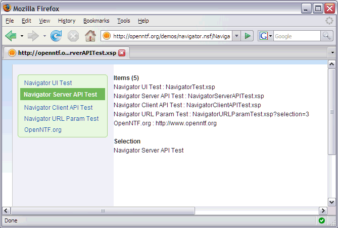
I’ve implemented another re-usable XPages control. It is a simple navigator that can be used to display links in a flat list, e.g. in the left sidebar.
You can get it from the OpenNTF catalog and you can try it live here.
With this control I want to demonstrate how I think re-usable XPages controls (as opposed to custom controls only) should be documented so that they can be as easily as possible reused. Each re-usable control needs to document the following topics:
- What design elements belong to the custom control
- The properties of the custom control(s)
- The URL parameters supported by the custom control(s)
- The client JavaScript APIs
- The server JavaScript APIs
- The used stylesheets
Here is how I’ve done it for the simple navigator.
How to re-use control in custom application
Copy the following design elements from navigator.nsf in your nsf or ntf:
• Custom control: ccSimpleNavigator
• Custom control: ccSimpleNavigatorConfig
• JavaScript library (client): SimpleNavigatorClient
• JavaScript library (server): SimpleNavigatorServer
• Resources-Themes: blue
Custom control: ccSimpleNavigator
This is the core custom control of the navigator. There are three properties to configure what links to show. Property name Type Default Description Sample value itemTitles string “” Comma delimited string with potentially multiple values “Navigator UI Test,Navigator Server API Test,Navigator Client API Test,Navigator URL Param Test, OpenNTF.org” itemLinks string “” Comma delimited string with potentially multiple values “NavigatorTest.xsp,NavigatorServerAPITest.xsp,NavigatorClientAPITest.xsp,NavigatorURLParamTest.xsp?selection=3,http://www.openntf.org” selection int 0 (if used in Xpage)
compositeDate.selection if ccSimpleNavigatorConfig is used Index of to be selected navigator item (starting at ‘0’) 0
Sample:
<xc:ccSimpleNavigator
selection=“#{javascript:compositeData.selection}”
itemTitles=“Navigator UI Test,Navigator Server API Test,Navigator Client API Test,Navigator URL Param Test, OpenNTF.org”
itemLinks=“NavigatorTest.xsp,NavigatorServerAPITest.xsp,NavigatorClientAPITest.xsp,NavigatorURLParamTest.xsp?selection=3,http://www.openntf.org”>
xc:ccSimpleNavigator>
Custom control: ccSimpleNavigatorConfig
A navigator is typically used on multiple pages. To define its configuration only once there is a second custom control that should be used in custom XPages and that contains the core navigator custom control. Property name Type Default Description Sample value selection int 0 Index of to be selected navigator item (starting at ‘0’) 0
Sample:
<xc:ccSimpleNavigatorConfig selection=“0”>
xc:ccSimpleNavigatorConfig>
URL parameters
There is one URL parameter to define the navigator item that needs to be selected. This parameter overwrites the value that has been defined in the compositeData of either of the two custom controls.
Sample:
http://localhost/navigator.nsf/NavigatorURLParamTest.xsp?selection=3
A constant has been defined in the JavaScript library ‘SimpleNavigatorServer’.
var URL_PARAM_SELECTION = “selection”;
Server side JavaScript library: SimpleNavigatorServer
Class SimpleNavigator Methods Input Output Description getItemCount – int returns the count of navigator items as int getItemTitle index:int string returns the title as string of the navigator item at position ‘index’ (index starting at ‘0’) getItemLink index:int string returns the link as string of the navigator item at position ‘index’ (index starting at ‘0’) getItems – Array of strings returns an array of strings with the titles of all navigator items getSelection context:XSPContext int returns the index of the selected navigator item as int. returns ‘0’ if nothing is selected (index starting at ‘0’). pass in ‘context’ (XSPContext) so that the parameter can be read from the URL getSelectedItemTitle context:XSPContext string returns the title of the selected navigator item as string. pass in ‘context’ (XSPContext) so that the parameter can be read from the URL
The class SimpleNavigator is initialized automatically by the custom navigator control. To use it you need to obtain an instance of this class (singleton): SimpleNavigator navigator = getSimpleNavigatorInstance();
See the unit test XPage ‘NavigatorServerAPITest’ for more.
Client side JavaScript library: SimpleNavigatorClient
Class UISimpleNavigator Methods Input Output Description getSelectedItemTitle – string returns the title of the selected navigator item as string unselectAllItems – – removes the selection in the navigator, if anything is selected
The class UISimpleNavigator doesn’t have to be initialized. To use the class simply create an instance: var navigator = new UISimpleNavigator(); alert(navigator.getSelectedItemTitle());
See the unit test XPage ‘NavigatorClientAPITest’ for more.
User styles and themes
The theme ‘blue’ is used by the navigator control.
The following styles which come with Lotus Domino 8.5 out of the box (not in navigator.nsf) are used by the core custom control. They can be modified by copying and pasting them into the NSF with the navigator and refering to them in the theme ‘blue’ instead of refering to the default files.
styleClass=“lotusMenu” styleClass=“lotusBottomCorner” id=“lotusBottomCorner” styleClass=“lotusInner” id=“lotusInner” styleClass=”lotusSelected”
Additionally the following style is used by the core navigator which can be modified directly in ccSimpleNavigator:
styleClass=“lotusMenuSection2”
Furthermore the following styles from Lotus Domino 8.5 are used by the sample and unit test XPages:
id=“lotusFrame”
class=“lotusBanner” id=“lotusMain” id=“lotusColLeft”

